
Spread out upper-row icons to make them easier to interact with.

On at least the Android version of the app, the upper row Icons (Search, Expand, Locate, New, and Layers) are crammed into the upper-right-hand corner of the screen, and they're much smaller than the available space allows them to be. This makes them hard to accurately touch when using the app in a mobile setting. 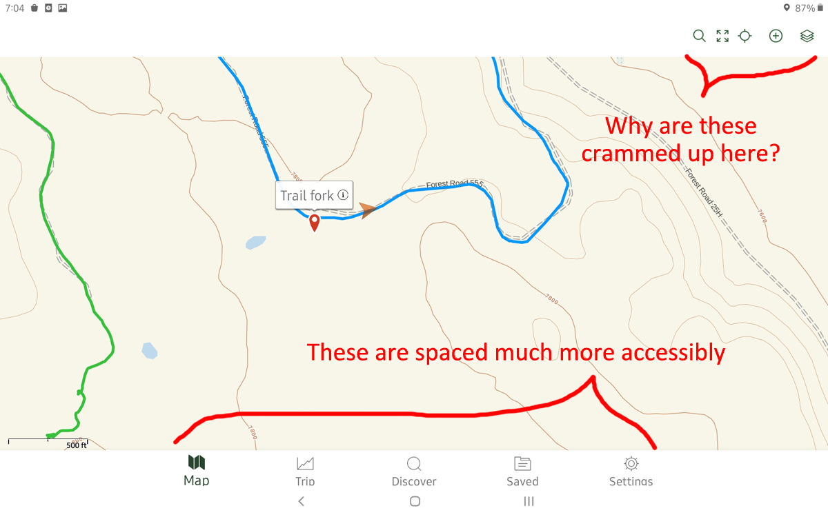 There is plenty of room to spread the icons out, as they are in the bottom row (Map, Trip, Discover, Saved, Settings) - whether in landscape or portrait mode - so I don't know why the design decision was ever made not to use that space. The result is a hard-to-use interface, when it would be much easier if they mimicked the bottom row.
My suggestion is illustrated below. Please consider spreading those icons out, and making the target buttons larger to make use of the space available. Labels are not as important as the physical spread of the icons, but I've suggested labels below as well: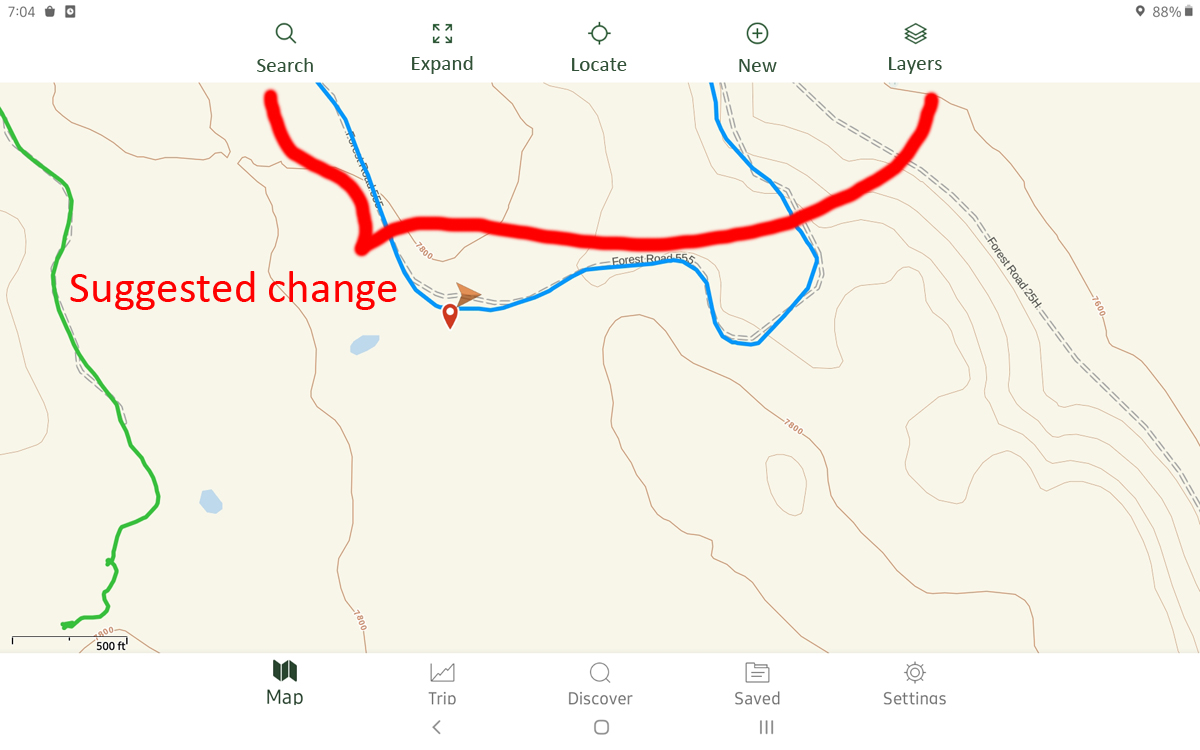 Thanks very much - I really enjoy using the app.
-

I need this... Old man fat fingers
1
Please sign in to leave a comment.
Comments
1 comment