
Tapping on screen only brings up Marked Location dialog

After a recent update to the ios app the behavior of tapping on the screen has changed. Now, wherever I tap on the map it brings up the marked location dialog. This isn't a problem per se, but now I can't select my waypoints or tracks, when tap on them it just brings up this new dialog. Was this a feature change or did my settings get messed up? Thanks
-

I was confused by this also. Look at the bottom of the screen, below the marked location, and you should see your previously saved waypoint or track.
See the red circled area of the attached photo.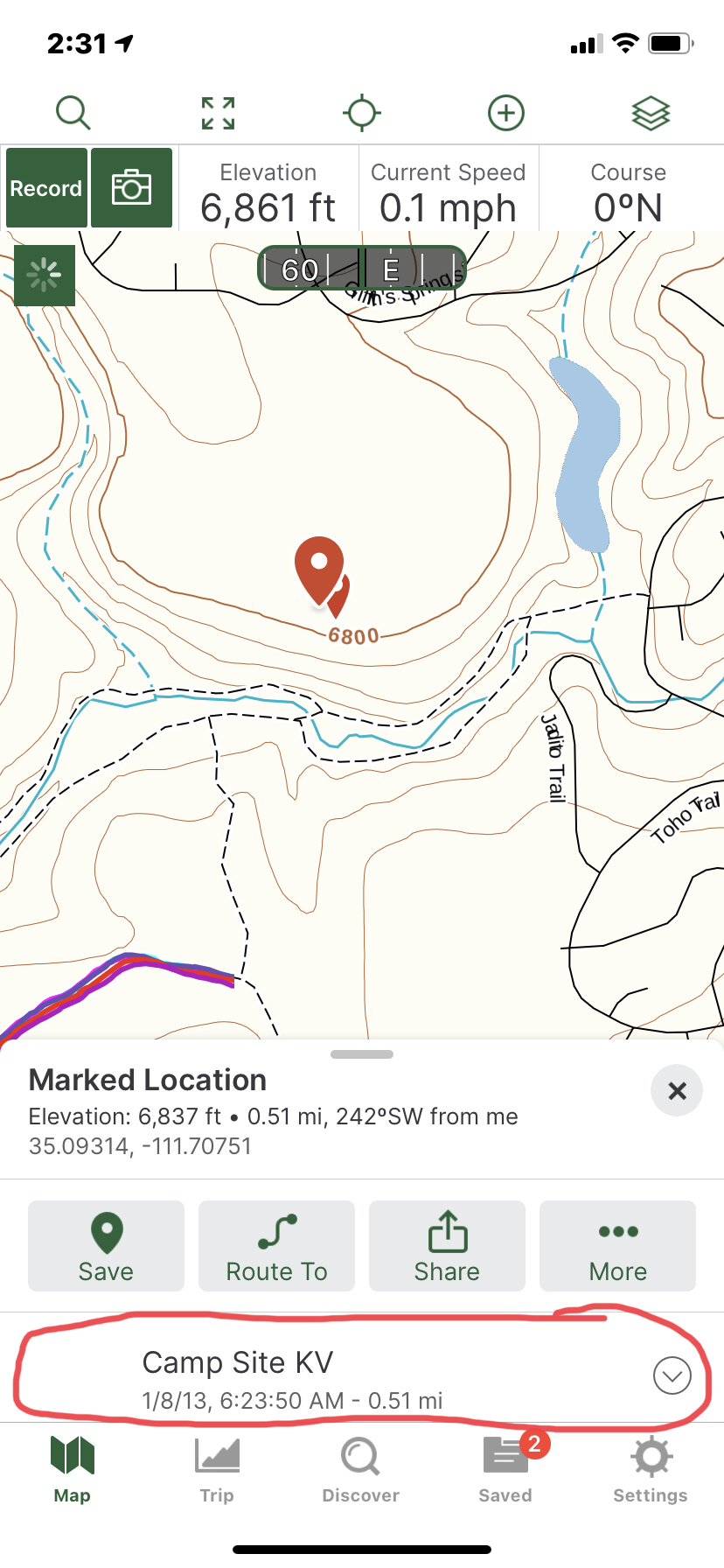 1
1 -
Awesome, thanks! I get it now, definitely not very intuitive though!
1 -

Can it be turned off? A long press would be/was fine. Now, any incidental touch leaves a marker and the screen gets filled with them. Not an enhancement, IMO.
2 -
Click the X to close the dialogue box and the new point will disappear. I’m not a fan of this new “feature” either.
2 -
True that — if you do it immediately. I’ve been unable to select a marked location after the fact. Instead, I end up with multiple marked locations. I’ve always appreciated Gaia’s clean interface. This “feature” is a huge step away from that simplicity. Thanks for the comment.
2 -

I hate this latest update 🤬
2 -

The tap drawer is an unnecessary, frustrating waste of time. The previous user interface was clean, straight forward and efficient.
Please GAIA either go back to the previous UI or make the tap drawer a user option in settings.2 -

Hi there,
Thanks for taking the time to write in about this.
I have passed along your feedback to the Engineers for consideration in future updates.
If you prefer, as of Gaia GPS iOS version 2021.4, you can choose to only enable the tap drawer after a long press (tap and hold for 2 seconds) instead of just a tap. To change this, tap Settings > Map Controls > toggle on Long Press to Select.
If you have any further questions, please contact Support here.0 -
Glad to see the dev team is considering alternatives to this, but the new option for long press doesn't restore the previous functionality of tapping on a waypoint with no extra effort. This is horrible UX, how about they bring back the old functionality and do a long press to bring up the drawer instead?
0 -

I completely agree. You should be able to tap a waypoint to select it and long press to get the drawer. Better yet, get rid of the drawer altogether as it is completely worthless. Instead, have a long press start a route etc. So, basically revert everything to how it was before the drawer was introduced. Please please please!
0 -
The new long-press adds nothing, and the drawer is worthless.
Please, revert to the previous model which worked just fine.
3 -

1. "You should be able to tap a waypoint to select it and long press to get the drawer."
I agree, make it easy to invoke the most popular function and, with a little extra effort, more function if you want it (which normally I don't). As implemented, this is a major problem for me, and it seems many others.
2. "Better yet, get rid of the drawer altogether as it is completely worthless."
I disagree, the drawer is not completely worthless; it is a salient example of horrible user ergonomics rolled out without sufficient user testing. It makes a great case study for Apple user interface experts.
1 -

I know this is harsh but this is an absolutely useless feature IMO, please restore the previous functionality or at least provide a way to disable tap drawer. It has caused me countless frustration simply trying to select a previously recorded trail. Using long press does not restore the previous functionality which is what everyone needs. Please fix this!!
0 -

I completely agree with the others above as well. We already had an easy an intuitive way to create waypoints, among other things, with the + button at the top. No need for redundancy, especially when we lose a really important function.
I have to turn my waypoint labels off because my screen will be too cluttered. It’s really important to be able to tap on a waypoint, track or route and be able to see the vital stats of that item like name and date created.
The drawer seems very cluttered with extra unnecessary steps. Cluttered because everything is listed including all of your map layers. Extra unnecessary steps because you have to do a bunch of extra scrolling and tapping if your going through multiple waypoints looking for the right one.
Please give us our ‘tap to select an item on the map’ back.
1 -

Agree with all the comments above. If you must keep the Map Drawer, the long press is a good option. But there should also be an easy way to select a track, as in the previous implementation. Furthermore, the map drawer is useless when you have multiple tracks in the same area, for example several tracks that overlap. It is extremely difficult to tell which track is which because the Map Drawer doesn't have the "Expand Preview Map" option, which is the easiest way to tell if the track you're selecting is the correct one.
0 -

Both in the web browser interface and the Android app interface, the single click = marked location is tremendously frustrating. Touching/Right Clicking the map is how panning around the map works. Panning around, or moving the map, is something a user (me, anyway) does constantly. This action constitutes about 98% of my interaction with Gaia GPS (app or online). Having to constantly close the 'Marked Location' dialogue is pretty annoying. For the occasional instance where I actually want to mark a location (which is very rare), I am more than willing to go through a specific, more complex action to do so. Basic HMI design should always be that the simplest user interactions (touching the screen or single clicking) are tied to the most common actions.
I mostly use Gaia for back country navigation - hiking, skiing touring etc.
1 -

This is frustrating. I'm trying to introduce other users to using Gaia, and their primary complaint is "I don't understand what's going on - I just touch something and suddenly it's doing something I don't know how to get rid of. I keep clicking on other places and it's just too complicated." Mind you, we use this not for walking along a lovely trail, but while driving at speed on curvy roads in roadsters, or offroading in Jeeps. The driver doesn't do it - the navigator uses Gaia. It's been very hard getting navigators to adopt Gaia, just because of this behavior.
It's killing your adoption rate, Gaia. Bump this up your development list.0 -

I started using Gaia just recently and I’m struggling with the unused markers left on the map as well. There’s no way to get rid of them. They don’t show up in the drawer, so you can’t delete them. Sometimes restarting the app helps. When the unused marker is there, the app always jumps to that location, when switching back to it, that is really annoying. Have a look at maps.me. Their point of interest interface is very user friendly and intuitive.
Also, when saving a POI on the web, it automatically copies the POI’s icon and information to the saved point. On the app this does not happen, which is odd.
0
Please sign in to leave a comment.
Comments
18 comments